See previous post first.
This was it's standing on the first morning...
After only a few hours, I thought this was pretty amazing, but it went on to do much more.
There was a time when it was the #1 top favourited video in film and animation for the month, and at one point, it had over 50 honors (unfortunately I failed to get a screen grab at that point).
the film now stands at way over half a million views, with over 17,000 "likes" and over 3,000 comments. I think that's pretty good for a 10 minute long beat poem!
I still find it absolutely amazing that we are living at a point in time when you can make a respectable looking film at home. A few of the shots that you see in Storm I made on my crappy old PC, that threatened to choke and die every time I tried to preview what I'd done. The space shot and the one that precedes it for example.
DC asked me to make it look as appealing/beautiful as possible. As he asked this, I knew I wanted to include a penumbra, which also meant working out how to do it (luckily I'd already been thinking about it for a while and wanted an excuse to try it out)
Its actually really easy (create a duplicate of what ever you want to cast a shadow, make it black, then add a radial blur (on zoom). There. That's the only trick I've got up my sleeve. Now everyone knows how I did it. I guess I'll be unemployed now.)
I'm still working with director DC Turner at the moment on something new, which I'll be able to post about later in the year.
Until then, I'll try and post some blog posts that I plan to do for fun...
Sunday, 8 May 2011
Thursday, 7 April 2011
Storm the Movie, online in the morning!
For those that don't know, Tim Minchin is a comedian (a fantastic one in my opinion), and he recorded a beat poem called Storm. I've been working on the animated version of it for a few months now and it's finally on youtube (2014 EDIT: It is also now a graphic novel. You can read about my small involvement here)
I was heavily involved in the making so it's hard to quantify what my actual job was, but there was some animation, compositing, storyboarding and a bit of character design.
T'was directed by DC Turner, and produced by Tracy King. Making it has been an absolute joy and I'm so happy that iot's finally going up for everyone to see. It was one of those projects where the end goal was never far from sight, but there was ALWAYS that one more badnik jumping up from that final bridge to prevent you making it. And yet, it was never anything less than a delight to work on. I am very grateful to have been a part of this project and I'd like to extend my thanks to DC and Tracy.
I was heavily involved in the making so it's hard to quantify what my actual job was, but there was some animation, compositing, storyboarding and a bit of character design.
T'was directed by DC Turner, and produced by Tracy King. Making it has been an absolute joy and I'm so happy that iot's finally going up for everyone to see. It was one of those projects where the end goal was never far from sight, but there was ALWAYS that one more badnik jumping up from that final bridge to prevent you making it. And yet, it was never anything less than a delight to work on. I am very grateful to have been a part of this project and I'd like to extend my thanks to DC and Tracy.
Wednesday, 2 February 2011
Clapham Life Drawing 2
UPDATE 22/8/2011: This class no longer runs.
Wednesday, 15 December 2010
Emerald Hill Zone
Being so busy at work has meant I may have neglected my duties as site artist for the website Zone Zero. Well here's my next piece, Emerald Hill Zone. The first from Sonic 2 and so my first to feature the deadly parasite, Tails.
Wednesday, 17 November 2010
Life Drawing at Clapham
Thursday, 21 October 2010
The Christmas LUSH commercial
I worked at Karrot Animation on this commercial. We used old Victorian etchings, and meticulously cut them up into animatable parts. Here in this video are the parts that I animated. Follow the link above for the full commercial.
Working on this was an absolute blast, and I hope to return to Karrot to continue work on their children's series when production starts
Lush credits
Directed by Tom Werber
Production Team:
Harj Bains
Rufus Blacklock
Ricky Earl
Working on this was an absolute blast, and I hope to return to Karrot to continue work on their children's series when production starts
Lush credits
Directed by Tom Werber
Production Team:
Harj Bains
Rufus Blacklock
Ricky Earl
Monday, 27 September 2010
Lift in Maya
Been a loooong time since my last post, I've been very busy animating at Karrot Animation for an advert for LUSH. I'll post my bits on that as son as it's done. In the mean time, here's a short animation exercise made in Maya
Monday, 16 August 2010
JULY 11 SECOND CLUB
Julys competition was a toughie. Very subdued dialogue and not much scope for gags....
Sunday, 25 July 2010
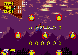
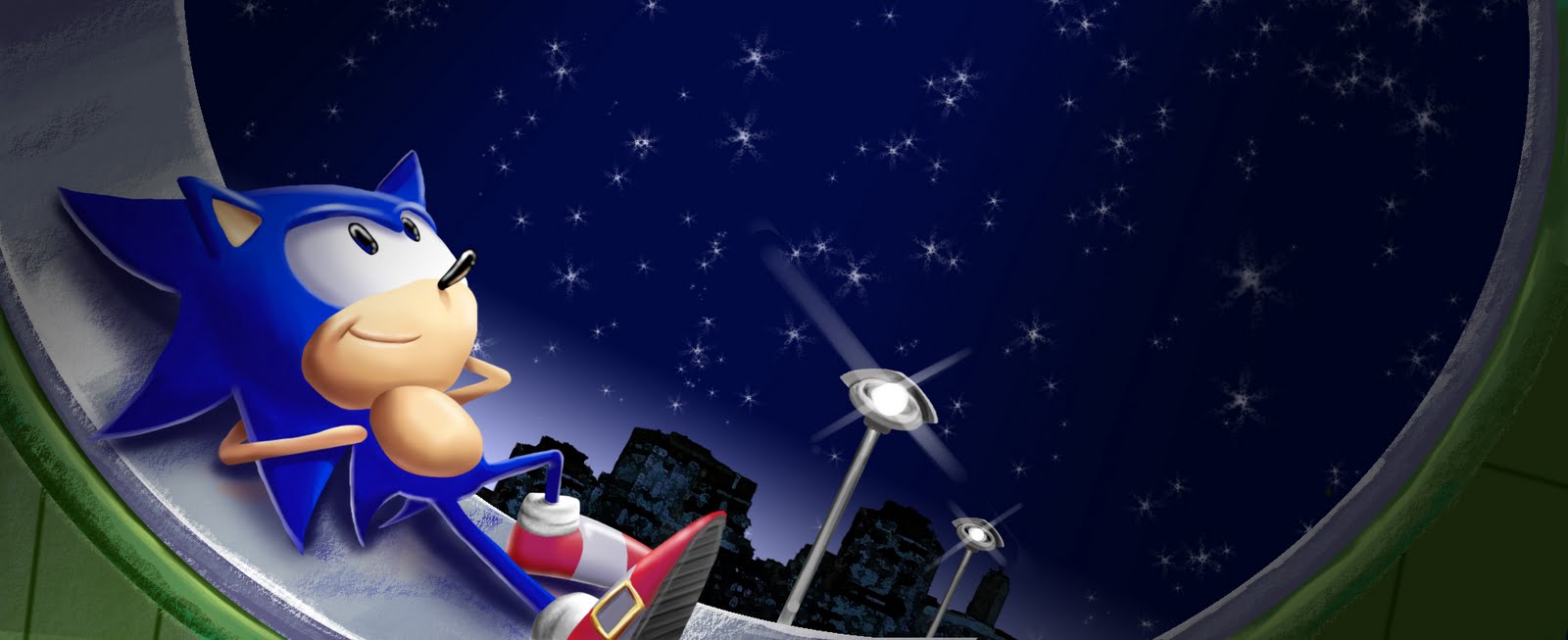
Scrap Brain Zone
The sixth in my level pieces for website Zone: 0
The final artwork I'm doing for Sonic 1, onto Sonic 2 now.
This is the furthest I've deviated from the original designs so far. But seen as though the music from Scrap Brain is so obviously inspired by Bladerunner, I wanted to pay a little homage too, though hopefully it's still recognizable as the original level.
EDIT: Doryan in the comments asked to see some sketches that led up to this. So I dug through some old hard drives to find the original PSD. Under all the layers was my original sketches underneath! UNFORTUNATELY, they are not very different from what you see. I settled on this idea immediately. This was early in my career as an artist and I had not yet been convinced by the importance of thumb-nailing loadsa ideas! So all you see is this one idea evolving slightly.
Sorry, Doryan. If you were looking for cool images, you wont find them here. All you'll find here is poorly drawn compositional sketches!
In fact the only thing that really changed was the curve..

I initially started with this composition. Much closer on Sonic, and an exaggerated curve to the landscape.

Here you can see I zoomed out a little, but kept the curve.

Here's where I lost the curve...

And this is the final sketch I used as a basis for the piece.
Thanks a lot to Doryan for asking! It was fun to look at this one again, and I was very glad to see that there was loads of stuff I'd improve on if I was doing it today.
The grad film that never was...S.E15 STORYBOARD
Thursday, 24 June 2010
Corfe Castle
Thursday, 3 June 2010
More Zone:0 artwork! SPRING YARD ZONE, LABYRINTH ZONE and STAR LIGHT ZONE!
Wednesday, 2 June 2010
The Making Of Badly Animated
There's work in this "making of" by myself, Tegan Jephcott, Mark Storer and Alex Cameron
Sunday, 23 May 2010
Artwork for Zone: 0


Zone: 0 is a Sonic the Hedgehog website, a pretty well made one too. A real labour of love for what at the moment is one guy. I thought I'd offer my services as site artist. I am doing a piece for each level. So far, Green Hill Zone and Marble Zone!
P.S I painted the far backdrop on green hill, but completely lost interest in doing the same for marble zone. So I ripped it from the game instead
Thursday, 29 April 2010
Saturday, 20 March 2010
Sunday, 14 February 2010
Tatsunoko Vs. Capcom competition
I really really really wanted the joystick for this game! So I entered the competition to win one. I had to design a character for the Capcom Vs. series fighting games. I figured it'd be judged by men so I went with the hot chick angle. Most of the entries thus far are all generic anime guys with troubled pasts looking for some kind of revenge, some even with big swords. I knew I didn't want to take this route.
I always loved the idea of Gen from the Street Fighter Alpha series and Street Fighter IV. You could hit all three punches or all three kicks and he'd change his stance, giving you access to completely different movesets. I wanted to extend this to 3 stances, one for offense, one for defense and one to take the piss out of your opponent (like Dan. It's such a great idea, having a character to show off how good you are that you can win with such a weak character with more taunts than actual moves)That got me thinking, what kind of person would have these three separate fighting styles? Someone with a split personality! The mask idea was to give a visible cue to the change. I originally had her store the spare masks on her back, but after a conversation with a friend I came up with this far more pervy idea. I didn't really want to do the whole sexy girl thing, but was talked into it! I WANTED TO WIN DAMMIT!
Well, I did win, came third, meaning I got the stick, a copy of the game and a signed poster. Pretty damn awesome, there was some stiff competition
Friday, 29 January 2010
Sunday, 3 January 2010
Saturday, 2 January 2010
Lip Sync CG animation to music
I love this song, so decided to animate part of it. The Matches, "Between Halloweens"
CG animation done in maya using the MooM rig, everything else done in Photoshop and After Effects.
Thursday, 17 December 2009
Saturday, 31 October 2009
Friday, 9 October 2009
Character test!
Monday, 21 September 2009
Almost a Production Still

Here's what I got for my grad film so far...this ins't the whole picture...missing a rather large CG element. Hand painted background going for a mix of styles. I wont post much for the film at all, and certainly not enough for people to get our story and steal it! Thanks to Teegs for rendering the character, would've done it myself but I lack a Wacom.
Thursday, 3 September 2009
Saturday, 29 August 2009
Souf's birthday card; mistakes...
So here's the illustration I drew for me ladies birthday card. (still no Wacom so coloured in pencil). Just her and a puppy. Some of it is ok, I constructed the person o.k, but ran for some reason, gave up when it cam to the dog. The dog isn't exaggerated to the same extent as Sofie so I think it looks odd. Also her hand is horrible.This morning I could see this card peeking put behind another birthday card on display, and the only thing I could see was the top of the head. I think this could've been better.

In yellow is how it is. In green is how I think I should've done it. I think having the fringe going forward would break up the blandness of the head silhouette and add a bit of variety to the form, rather than one oval on top of another...
Tuesday, 25 August 2009
Wednesday, 12 August 2009
Bad C.G animation
lip sync from Ricky Earl on Vimeo.
Only one is guy is animated here. I think the lip syncing here is spot on for the main guy but the acting and animation leaves a lot to be desired. It kinda just goes from key to key without much attention to overlap or anything fancy.
The other one here....well...this is what happens when you spend too long on something...
lip sync 2 from Ricky Earl on Vimeo.
Thursday, 6 August 2009
Animation for grad film; I.O
Whilst in the first year, I got a chance to do some animation and cleanup for the graduation film I.O (Input, Output). This one is meant to portray someone turning on an appliance in a world where nobody really cares about wasting energy.
This one is a background character in one shot. I did a whole lot more but I don't have the files!
The film can be viewed in its entirety here
This one is a background character in one shot. I did a whole lot more but I don't have the files!
The film can be viewed in its entirety here
Wednesday, 5 August 2009
Title Sequence animation
Title Sequence (animatic and final) for Curious Minds from Ricky Earl on Vimeo.
Here is an animatic and a final version (FAST FORWARD THE CLIP TO 00:43 TO SKIP TO THE FINAL) of the title sequence that Harj Bains and I made while we were on work experience at Dibulitoon Studios, Spain. We were given total creative freedom and with the ideas, the only thing we had to stick to was the cut out style of animation, under the directors request. Everything else was all us.
It is for a kids science show, unfortunately I don't have the version with music...
Made in After Effects and Photoshop.
It is for a kids science show, unfortunately I don't have the version with music...
Made in After Effects and Photoshop.
Wednesday, 29 July 2009
Almost Recent
Concept work for a rather feminine dragon. This has a rather horrid silhouette, his hand blends into his shoulder on the left. I should have had the arm come out a little bit and created a little negative space between the hand and shoulder...
This one was the title page for an assignment I was given before I started the first year. We had to storyboard someone brushing their teeth. ( I guess it was an exercise in making something dull look exciting.) I may or may not have recycled the dog in a more recent project.
Ideas for a title sequence I worked on in Spain. I never could be bothered to colour the girls. Much more interested in the cheetah (which has incorrect spots)
Wednesday, 15 July 2009
OLD ANIMATION
Taximan from Ricky Earl on Vimeo.
This was an exercise into sound syncronisation. Heavy influence from video games on the design here; the buildings inspired by SNES Starwing and the car ripped off from Crazy Taxi (made in 2002)
Tuesday, 14 July 2009
Feet
Hands
Subscribe to:
Posts (Atom)